Why is choosing wall color so important?
Choosing the right wall color can be a challenging task. Many factors must be considered, such as the room’s size, natural light, and interior design style.
The color of the walls in the interior is not just a background, but an element that:
- creates the mood of the room;
- affects the perception of space;
- emphasizes the style of furniture and decor;
- helps to zone the space.
An incorrectly chosen shade can visually reduce the size of a room, making it gloomy or uncomfortable.
How to choose the color of walls for your home?
Color schemes can be divided into two main groups: warm and cool shades. White walls provide the perfect backdrop for interior design and visually enlarge the room. Pastel wall tones make bold and vibrant colors appear more subdued and delicate. On the other hand, darker colors can add a cozy feel.
Consider the size and shape of the room as:
- light shades visually expand the space;
- dark tones make it intimate and cozy;
- vertical color divisions raise the ceilings;
- horizontal lines visually expand the walls.
Neutral and light shades—white, off-white, beige, and light gray—are the most popular. They visually expand a space and create a sense of cleanliness and tranquility. These colors are versatile and make an excellent base for interiors.
It’s hard to find a more versatile color than white. This color scheme suits many spaces, combinations, and styles, pairing well with virtually any color. Neutral white shades not only harmonize but also highlight the beauty of wood grain, its structure, and natural brown tones.
Additional information! It’s important to remember that a room painted white in excessively dark shades can appear drab and depressing. An entire interior dominated by white can appear sterile, monotonous, and depressing.
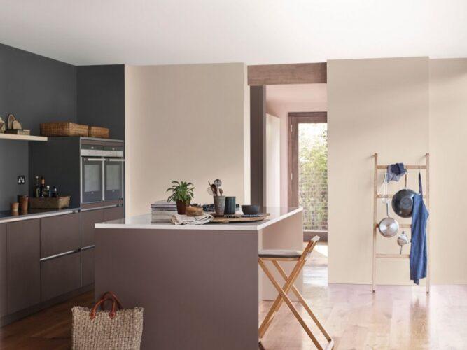
Beige is often used as a backdrop for other colors or as the main element of an entire composition. This versatile color pairs well with both neutrals and bold contrasts. Shades of beige range from light to dark, offering a wide range of options to suit individual preferences. Warm wall colors, such as soft beige, can create a cozy atmosphere.
Pink is used in home arrangements in a wide range of shades, from delicate powder pink to muted dusty pink. Delicate pink pairs beautifully with light-colored arrangements.
Cool shades are dark and rich
For bold designs, consider dark blue, charcoal gray, burgundy, or black, especially in spacious rooms. However, it’s important to maintain balance with these colors to avoid overpowering the space.
- Dark blue is stylish and noble.
- Burgundy adds depth and is suitable for accent walls.
- Graphite and anthracite – for modern minimalism and loft.
- Mint, turquoise, and smoky gray create a feeling of freshness and lightness.
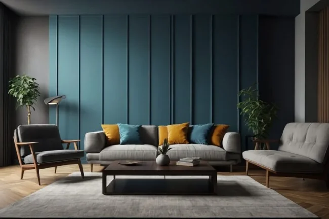
Wall finishes in cool colors, such as sapphire navy or refreshing mint, can give the living room a more contemporary feel. These cooler colors pair well with dark furniture, creating a contrasting effect.
How to use dark colors?
Dark colors in interior design have become one of the most popular trends of recent years. Dark wall colors, such as navy blue, deep gray, or bottle green, lend elegance and sophistication to the interior and work best in well-lit spaces. Light furniture looks great against dark shades, making dark walls more expressive and adding depth.
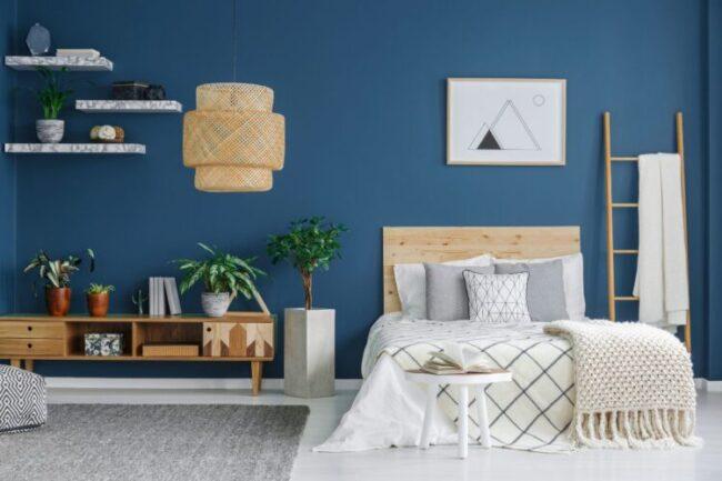
Blue . All walls painted blue is suitable for large, well-lit spaces. One accent wall is the safest option. Blue will highlight a particular area and add expressiveness to the interior. In dark rooms, deep blue can appear even darker.
What colors go with blue? It looks perfect next to white, soft gray, and cream. Dark blue creates a stunning contrast with white, while shades of gray give the living room an elegant and understated look.
Brown can be either a background or an accent color in an interior, depending on the shade. In small rooms, light shades of brown—cappuccino, caramel, and beige-brown—are best. Shades of brown on the walls highlight the texture of the wood. What colors go with brown? Cream, beige, navy blue, and muted pastels (dusty pink, sage).
The best shades and successful combinations for comfort and harmony in the interior
The dominant color of the walls is not just a background, but a tool for creating mood, zoning, and visual harmony.
Consider the psychology of color:
- blue and light blue are calming;
- yellow and orange are invigorating;
- Green relaxes the eyes and relieves fatigue.
- Red is exciting, but too much of it is tiring.
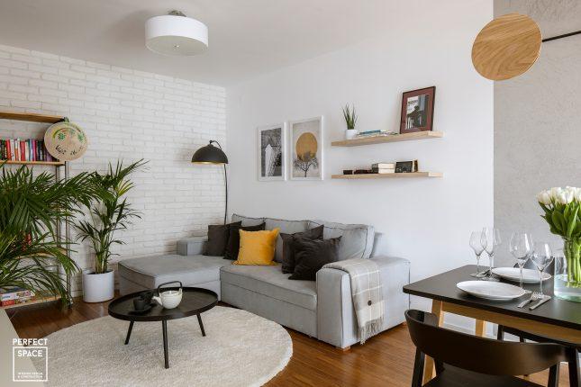
For the living room . The living room is a place where people spend time with family and friends, so it’s important that the color scheme promotes relaxation and creates a cozy atmosphere. Neutral shades such as beige, gray, white, and pastels are a versatile choice, providing an excellent base for a wide variety of design options.
However, bolder accents can also be used in the living room, such as bottle green, navy blue, or rich shades of burgundy, which will add elegance and personality.
For the bedroom. The bedroom should be a tranquil space, so avoid sharp contrasts in favor of smooth color transitions. It’s important to create a calm atmosphere in the bedroom; avoid bright reds and bold colors. Use pastel shades of blue, green, and beige.
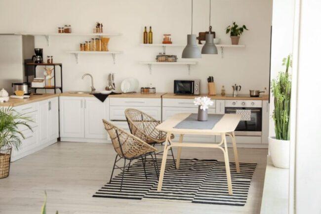
For the kitchen. Modern kitchens often feature neutral colors like white, gray, and beige, which create a clean and fresh feel. Light tones create a neat and tidy space and also visually enlarge it. Dark tones are suitable for an accent wall, but not for the entire kitchen.
For a child’s room, you can use bright accents (yellow, orange), but don’t overload the space with them. Here, color influences the child’s mood. Blue, mint, and peach are calming and soft.
Common mistakes when choosing wall colors
To narrow your color palette and simplify the selection process, consider the amount of light in the room. Light wall colors reflect light and visually enlarge the interior, making them ideal for dimly lit rooms. However, if there’s plenty of natural light, darker wall colors are appropriate.
Please note! Lighting is a key factor. The same shade will look completely different in a sunny room than in a dark one. In small northern rooms, it’s best to use light, warm tones. In spacious, sunny rooms, deep, saturated colors are appropriate.
Too many dark shades. Dark walls can add a cozy feel, but if overdone, the room will feel gloomy. It’s better to use them as an accent—for example, to highlight one wall or area.
An overly monotonous palette. If the entire room is painted in a single tone, the interior looks boring. Designers recommend combining several similar shades or adding contrasting accents.
How to combine different wall colors for decoration?
Painting all the walls a single color without any contrast or separation can seem boring and bland. To create a more interesting effect, consider using different colors or separation techniques. A striking effect can be achieved by combining white and black, using contrast. This combination would look great in a white living room, bathroom, or kitchen.
Please note! You can create color blocks on the wall: stripes, squares, arches, which may differ from the main wall color. However, it’s important to use appropriate techniques to avoid overdoing it and creating a disharmonious effect.
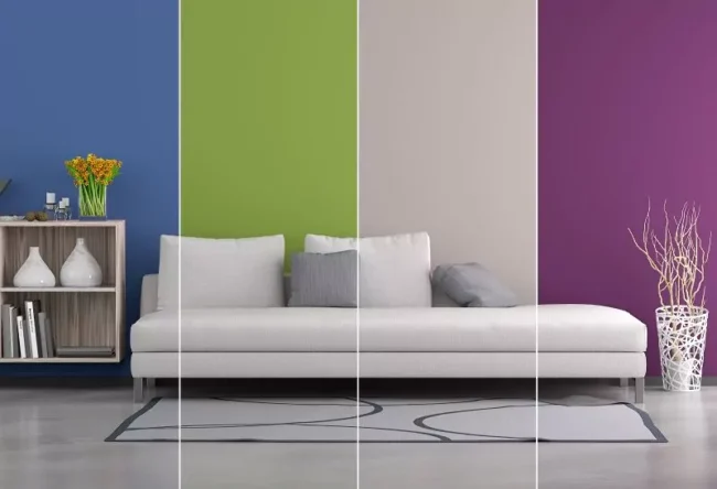
One way to combine different wall colors is to use vertical division. You can paint one side of the room one color and the other a different color, for example, using contrasting colors like white and black. For a more subdued combination, you can choose two shades from the same color palette.
Another option is to use horizontal division. This can be achieved by painting the lower portion of the wall a different color than the upper portion. This method is especially suitable for rooms with high ceilings or for creating a sense of separation between individual design elements.
Color combinations in the interior
Accent wall. Highlighting one wall with a brighter color adds dynamism to the interior.
Color blocks . Geometric shapes or stripes allow you to zone a room.
Harmony 60-30-10 is the golden rule of designers: 60% is the main color (for example, beige); 30% is the additional color (gray, olive); 10% is the accent color (yellow, turquoise).
Designer tips for choosing wall colors:
Always do test paints on a real wall.
Consider lighting and window orientation.
Don’t be afraid to combine neutrals and bright shades.
Keep an eye on balance – too many dark colours will make the interior feel heavy.
Use accessories (curtains, pillows, paintings) for additional accents.
Frequently Asked Questions
What wall color is best for a small room?
Light shades (white, beige, pastel) will visually enlarge the space.
Is it possible to paint all walls a dark color?
Yes, but only with good lighting and in a spacious room. In small spaces, it’s better to limit yourself to an accent.
What is better for the kitchen: light or dark walls?
Light colors are more practical and make the kitchen feel more spacious. Dark colors can be used as an additional design element.
How to match wall color to furniture?
Neutral shades are versatile and suit all styles. If the furniture is bright, it’s best to keep the walls subdued.
The choice of wall color depends on the room’s size, lighting, style, and personal preference. The right palette will help make your home cozy, spacious, and modern. The background of the interior doesn’t necessarily have to be a single color; a mix is possible, although this should be approached carefully to avoid unnecessary chaos.